Conversion Rate
Completed checkout
CRV ( was 1.13% )
Problem
The Spirits Embassy needed a revamp “to evolve from a whisky retailer to a trusted spirits experts,” expanding new business verticals that completes their promise of true whisky and
spirits authority.
Old Design

Solution
A unified experience for key user - beginners, enthusiast and collectors, focusing on personlaized discovery journey with strong trust signals consideration. The platform was build on a mental model to cover both business and users pain points, addressing dated visuals, unclear offerings to confident UX structures with improved and enhanced navigation and optimized interaction for each stage of the spirits shopping journey.
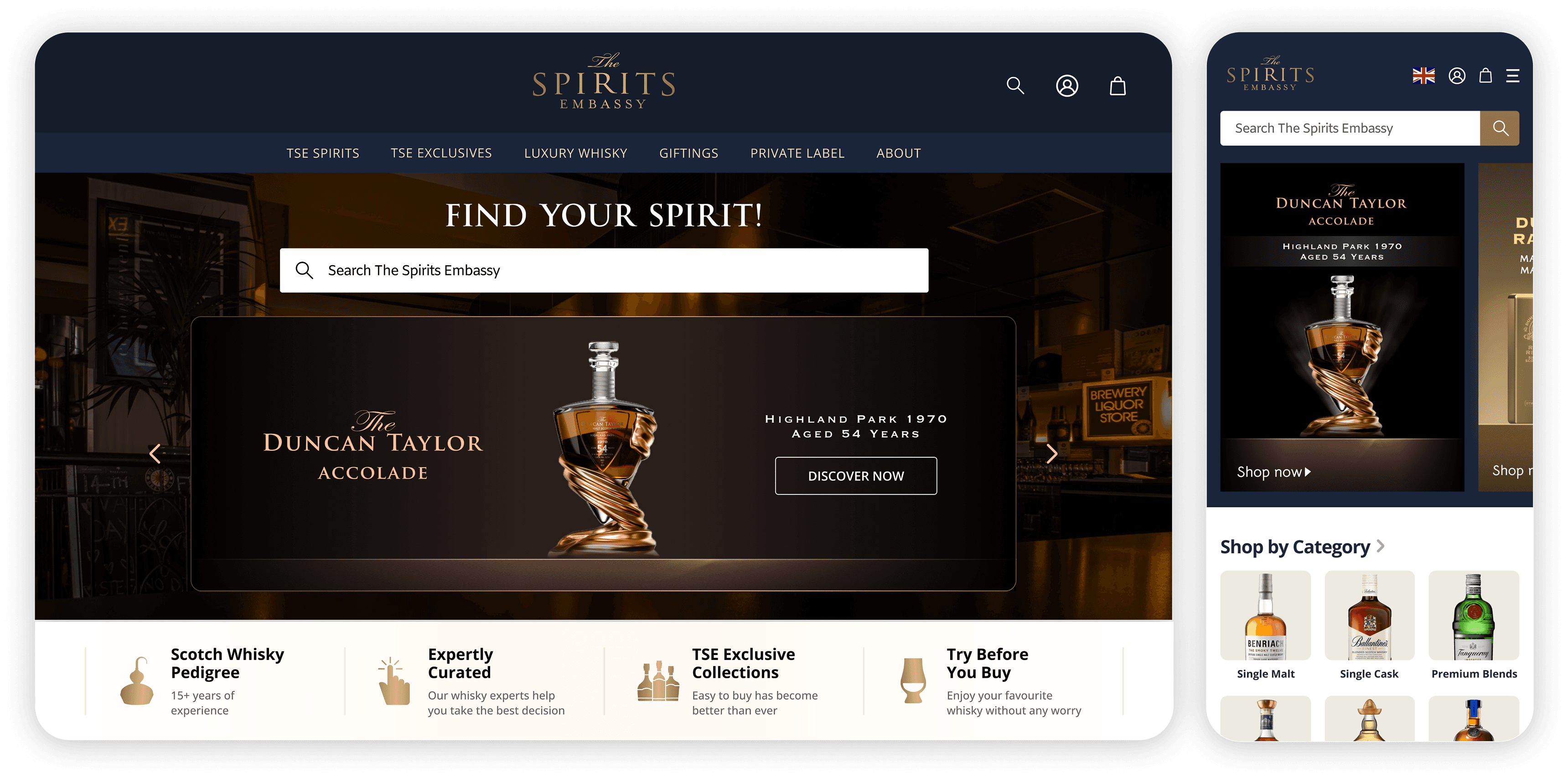
New Design


Challenge
How might we create a premium and trustworthy digital experience that helps customers feel confident and excited to purchase high-end whisky online?"
I was provided the following needs and constraints:
To improve Visual design and shift to their new physical store theme.
Working on predefined Homepage skeleton and old page structures(PLP, PDP).
To consider scalability, improve category navigation and discoverability on home page with clear value proposition.
Constraints:
Tight timeline
Limited resources
Shopify Development limitations
Research
Userstanding users job
The main target audience of TSE are beginners, enthusiast, connoisseurs, collectors and B2B owners.
The primary focus was to target the whisky connoisseurs by enabling exclusive and rare whiskies.
For beginners and enthusiast we wanted to make the explore and discovery process intuitive and friendly.
The platform also has to cover services like gifting, personalization and cask ownerships, which will complete the spirits purchase journey .

Reviewing the Old Store
Before jumping into redesigns, I spent time understanding what wasn’t working in the current online store. I started by walking through the entire shopping experience as a user from landing on the homepage to completing checkout.
Key findings were:
visuals felt dated and didn’t match the premium positioning of the products.
lacked clear value proposition hierarchy
use of imagery was subpar
testimonial and trust signals were missing

Understanding the Competition
The three strongest competitors - The Whisky Exchange, The Whisky Shop, and Master of Malt, build premium trust through strong social proof, expert curation, and service transparency. They open with credibility (heritage, reviews, authority) and close with excitement via exclusives, limited editions, and rewards.

Key User Stories
After reviewing the old site, competitive analysis, user mapping, we were able to understand users motivations and the pain points that exist with the old site purchase experience.
As a beginner, i want ease while exploring and discovering spirits before i make a confident purchase.
As an enthusiast, i want discovering new liquors to be effortless and expertly guided.
As a connoisseur, I want ease in finding and browsing authentic, richly crafted spirits efficient and helpful.
As a collector, i want to easily discover and buy exclusive, limited edition and verified sourced spirits.
As a B2B buyer, i want the best value products and services from TSE.
Iteration
Early exploration
To begin the design phase, I focused on the homepage since it serves as the main entry point of the platform and the first touchpoint for users. I explored multiple design directions and developed two distinct homepage concepts. Each concept was guided by the synthesized research insights and highlighted a different flow, visual hierarchy, and approach to presenting key information.The primary focus was to target the whisky connoisseurs by enabling exclusive and rare whiskies.

Early Feedback
Early feedback revealed that the site lacked a clear, progressive way for users to explore and discover content. The navigation and flow needed to be simplified and structured more intuitively. Visually, the design language wasn’t cohesive and looked a little cluttered. Also TSE brand’s key offerings and messaging weren’t receiving enough emphasis.
Final Design
Home page design

Product Listing page design
We designed two distinct product listing experiences, one for general spirit categories, and another brand-focused listing page that highlights each brand’s story alongside its product range.

Product detail page
Redesigned the product detail page with improved visual hierarchy, streamlined metadata, clear product details, and an accessible review section to enhance product education, user confidence, and overall shopping experience.

Final design (Mobile)
Mobile inclusive experience
The design approach for mobile experience was inspired from quick commerce products where we focused on clean interfaces, fast navigation and simplifying discovery with tailored shopping experience for every user type


Takeaway & Reflection
Working on an online retail store redesign was challenging and a rewarding experience.
A single designer cannot work on an entire revamp of an online store experience
Its crucial to understand the structure and architecture of the site before making any changes
Understanding the traffic and choosing an approach accordingly for greater design impact
Final note: If i had to redo this project i would start with knowing anything and everything about the store, and start positioning it right with the help of business owners, next for each decision taken making a design intervention which would bring the max impact and revenue.